Tools for Visualization
By Sarah Pittroff
Presentation slides for this topic
https://studiengang-digitale-methodik.pages.gitlab.rlp.net/modul-5/5c/slides/visualisierung/2022/
Canon(s) of Digital Cultures – Data Visualization
01 What is Data Visualization?
Possible answers:
- https://www.hessenschau.de/politik/landtagswahl/ergebnisse/ergebnisse-der-landtagswahl-2023-in-hessen-vorlaeufiges-endergebnis-v14,landtagswahl-ergebnisse-100.html
- https://maps.app.goo.gl/aRgpX1CRCubwzwbVA
- https://x.com/researchremora/status/1708936472286351694?s=20
- http://lab.culturalanalytics.info/2016/04/exploratory-visualizations-of-thomas.html
- https://katjadittrich.de/
- https://kachelmannwetter.com/de/messwerte/temperatur.html
What is Data Visualization in the Humanities?
Timelines:
or maps:
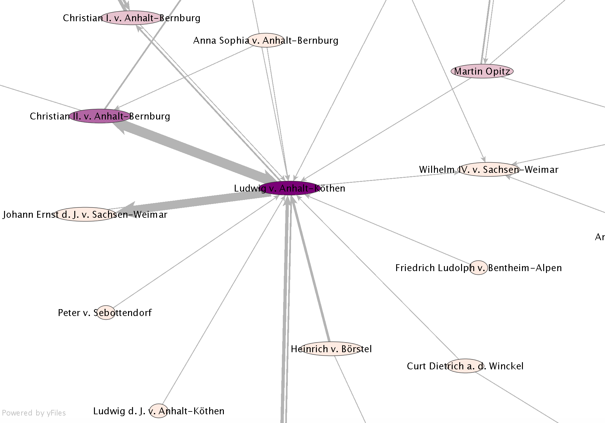
and oftentimes networks:
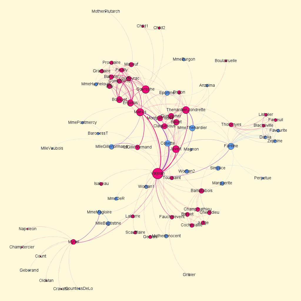
What is Data in the Humanities?
- (Research) Data
- digitized object data
- texts
- images
- sound
- moving pictures
- Meta Data
- creation date
- digitazion date
- author
- locality
- iconography
From variables to visuals: What kind of data can be visualized?
- Structured data as
table, database, network, geo-spatial, time series, 3D model
- Unstructured data as
text, image, video, sound -> must be structured to be visualized :D
Structured data (variables) goes to+ visual/graphical form (visuals)
What is data visualization good for?
- Tool for handling amounts of data or information that are either so large or so complex that the human mind cannot oversee them without external tools
- Generate knowledge through explorative analysis from large (unstructured) data corpora
- Finding errors in the data set
- Showing an argument
Reasons to Visualize Scientific Data
Visualization of data in different functionalities for the research process:
Explorative analysis
I am interested in the data set in general and try to pose undirected questions to the data by different designs of visualization (–> targeted array with different parameters that are changed according to a certain pattern).
Confirmatory analysis
I am specifically pursuing an assumption and would like to work out a significance (accumulation) or correlation (context). Perhaps I have worked out a clue by explorative data analysis, which I can now track down with a modified data set in a confirmatory analysis.
Explanatory Visualization
Here I present data to a public. The focus is on a very specific aspect, which I would like to present visually within the scientific argumentation. As the term “explanation” already says, an argument, a relationship is explained, but the visualization also has a proving character.
Explorative and confirmatory analysis foster gain in knowledge, explanatory analysis explains this knowledge.
02 Methods
Visualization of information as in different points of view:
- Macroscopic level shows overarching structures (Distant Reading)
- Microscopic level enables detailed views on data sets
Visualization of information is interconnected in the resarch process
- Data Sampling
- Analysis based on algorithm
- Visualization of data
- Hermeneutic interpretation of visualization
These four steps are interdependent phases. They have to be thought of as biderectional dependencies and can’t be imagined as seperated actions. For the sake of a good visualizaton we have to take care of two premises: comparability and consistency of data.
Popular Visualization Techniques
- 1 variable: e.g. bar plot, line plot, histogram, pie plot, radar plot.
- 2 variables: e.g. scatter plot, heatmap, map.
- multiple variables: e.g. scatter plot matrix, mosaic plot, parallel plot.
Good overview on many techniques (starter): https://datavizproject.com/
Good overview on many tools (progressiv): https://visualisingdata.com/resources/
Visualization of Variables
Reference systems and their visual structures:
- Temporal reference is displayed with time series: bar plot, line plot, histogram, heatmap (= techniques)
Tool: Raw Graph App and Raw Graph Turtorials
- Spatial reference is displayed via data maps: heatmap, map, radar plot (= techniques)
Tools: https://www.mapbox.com/mapbox-studio/ https://www.datawrapper.de/maps https://hdlab.stanford.edu/palladio/
- Abstract reference is represented by different forms of diagrams (= technique)
Tools: https://hdlab.stanford.edu/palladio/ https://app.rawgraphs.io/
- Relational reference is represented by graphs and trees (=techniques)
Tools: https://hdlab.stanford.edu/palladio/
Examples: https://morphocode.com/location-time-urban-data-visualization/ https://humansofdata.atlan.com/2016/11/visualizing-time-series-data/
Visual structures: examples
Time Series
Number of job advertisements placed in the daily newspapers Passauer Zeitung und Kurier für Niederbayern in the period 1914–1918

Data Map
John Snow: Spatial Visualization of Cholera Cases in London 1854

Time series / Data Map
Charles Minard: Carte figurative des pertes succecives en hommes de l’Armée Française dans la campagne des Russie 1812-1813

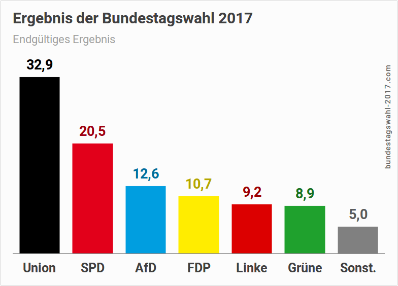
Abstract reference: Diagram
Gantt chart: Results of the Bundestag elections 2017
Graph
Briefnetzwerk der „Fruchtbringenden Gesellschaft"
03 Tools Hands On
Workshop Website
04 Data Hands On
Data Sets
05 Workshop
Workshop Website
Literatur
- Roxana Kath, Gary S. Schaal und Sebastian Dumm, „New Visual Hermeneutics“, in: Zeitschrift für germanistische Linguistik 43/1 (01.01.2015). Online: Crossref, DOI: 10.1515/zgl-2015-0002.
- Malte Rehbein, Informationsvisualisierung. in: Digital Humanities: eine Einführung, herausgegeben von Fotis Jannidis, Hubertus Kohle und Malte Rehbein, S. 328-342, Stuttgart 2017.