09.10.2020 | Digitale Akademie
Werkzeuge zur digitalen Verarbeitung geistes- und kulturwissenschaftlicher Information
Visualisation
Methods and tools for critical reflections on data
Slides: https://studiengang-digitale-methodik.pages.gitlab.rlp.net/modul-5/5c/slides/visualisierung/2020/
Sarah Pittroff, Aline Deicke |
 @digicademy |
 digicademy |
CC-BY 4.0
digicademy |
CC-BY 4.0
Content
- Theory
- Tools
- Hands-on
- Wrap up
01
Theory
Visualization – what is it good for
- Tool for handling amounts of data or information that are either so large or so complex that the human mind cannot oversee them without external tools
- Generate knowledge through explorative analysis from large (unstructured) data corpora
- Finding errors in the data set
Visualization in the research process
- Explorative Analysis
- Confirmatory Analysis
- Explanatory Visualisation
What can I display and how?
- Temporal Reference: Time Lines
- Spatial Reference: Data Maps
- Abstract reference: various types of diagrams
- Relational Reference: Graphs and Trees
Dot and Line Diagram 1
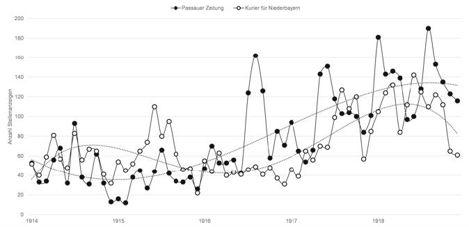
Number of job advertisements placed in the daily newspapers Passauer Zeitung und Kurier für Niederbayern in the period 1914–1918
Dot and Line Diagram 2
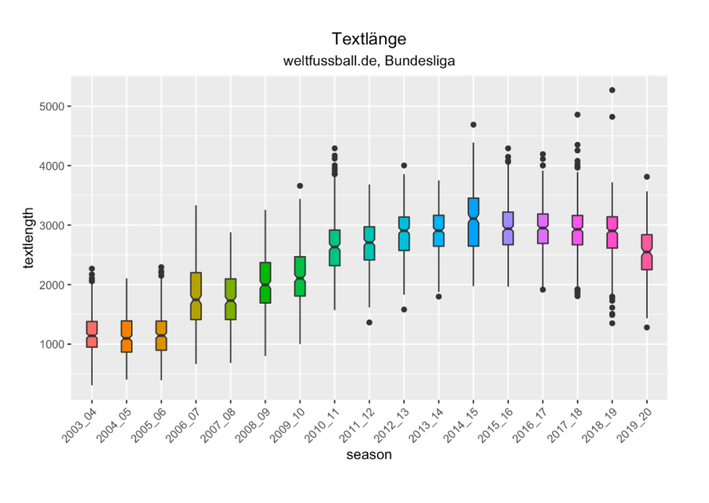
Length of "Liveticker" text about the Bundesliga provided on weltfussball.de in the period 2003-2019 Source: Liveticker – Evolution einer Textsorte aus quantitativer Sicht by Simon Meier-Vieracker
Data Map1

John Snow: Spatial Visualization of Cholera Cases in London 1854

Time Series / Data Map

Charles Minard: Carte figurative des pertes succecives en hommes de l'Armée Française dans la campagne des Russie 1812–1813
Abstract reference 1
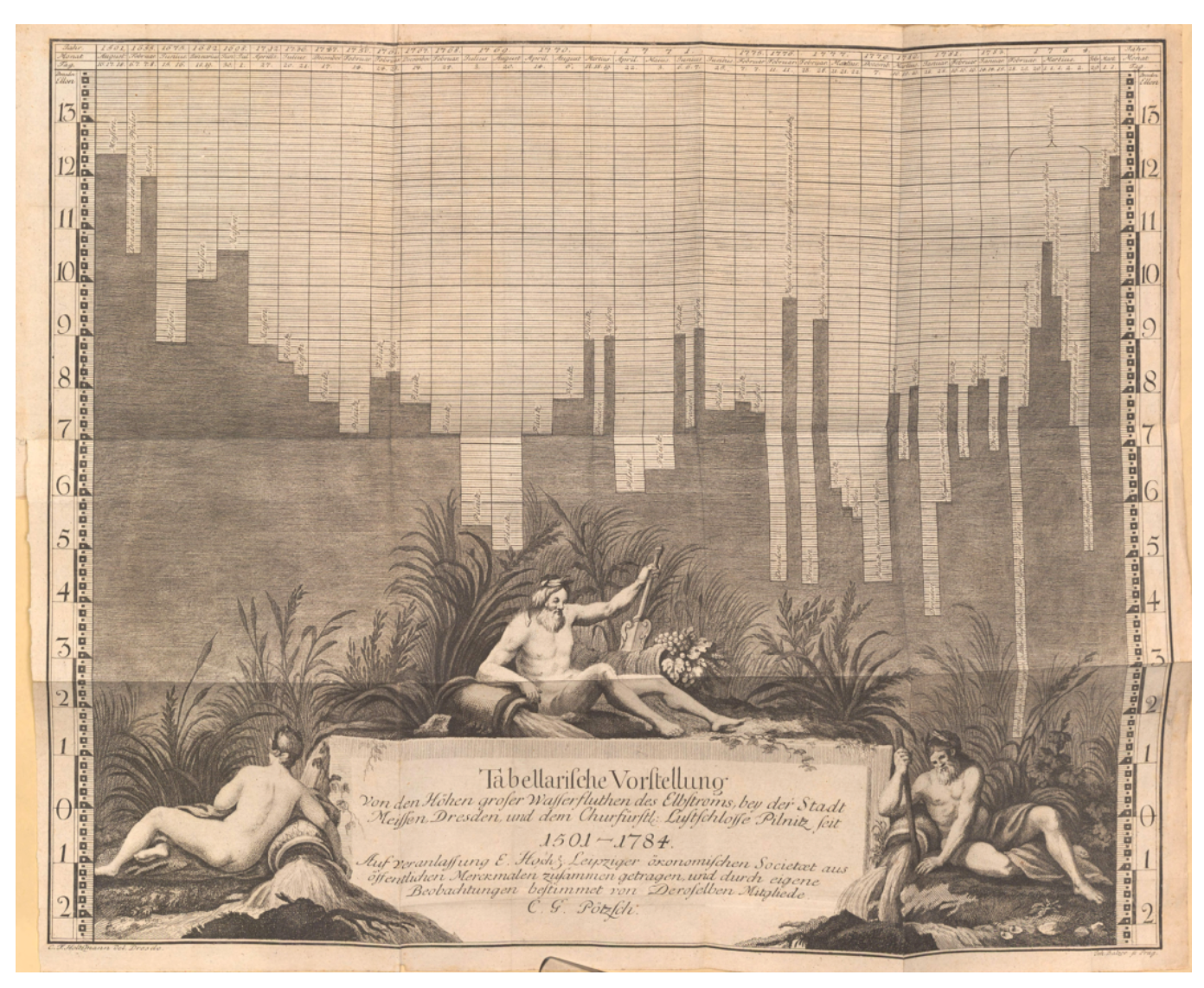
Box diagram showing a foldout chart from "Chronological history of the major floods of river Elbe since a thousand and more years" (in the period 1501-1784), by Christian Gottlieb Poetzsch 1784, Courtesy of Bayrische Staatsbibliothek
Abstract reference 2
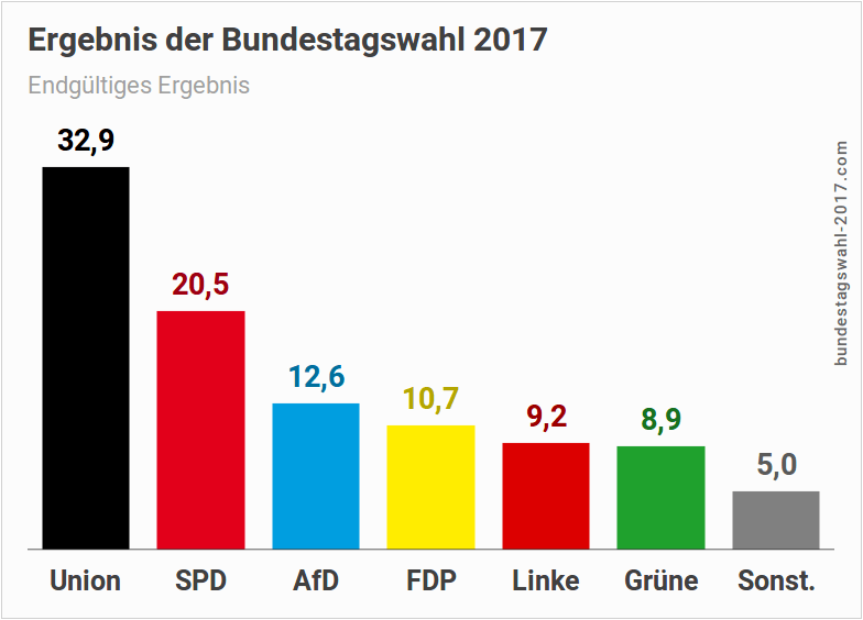
Box diagram showing results of federal elections in germany 2017
Visualization of information
is complex interwoven in the research process
- 1. data sampling / data processing
- 2. algorithm based analysis
- 3. data visualization
- 4. hermeneutic interpretation of the visualization
Note
These four phases are interdependent.
Important for visualization is the consistency and comparability of the data.
Therefore, there is a risk of misinterpretations due to poorly designed visualization.
- Annotations make information in sources explicit
- Explicit information becomes machine-readable
- ... and visualizable by machine
- Next steps: Interpretation and Contextualization of the Visualized
→ Visualization is always a reduced model of the abstracted
02
Demo and Hands-on
Introducing data set
Introducing tools for data visualization
Data set
Breakout rooms
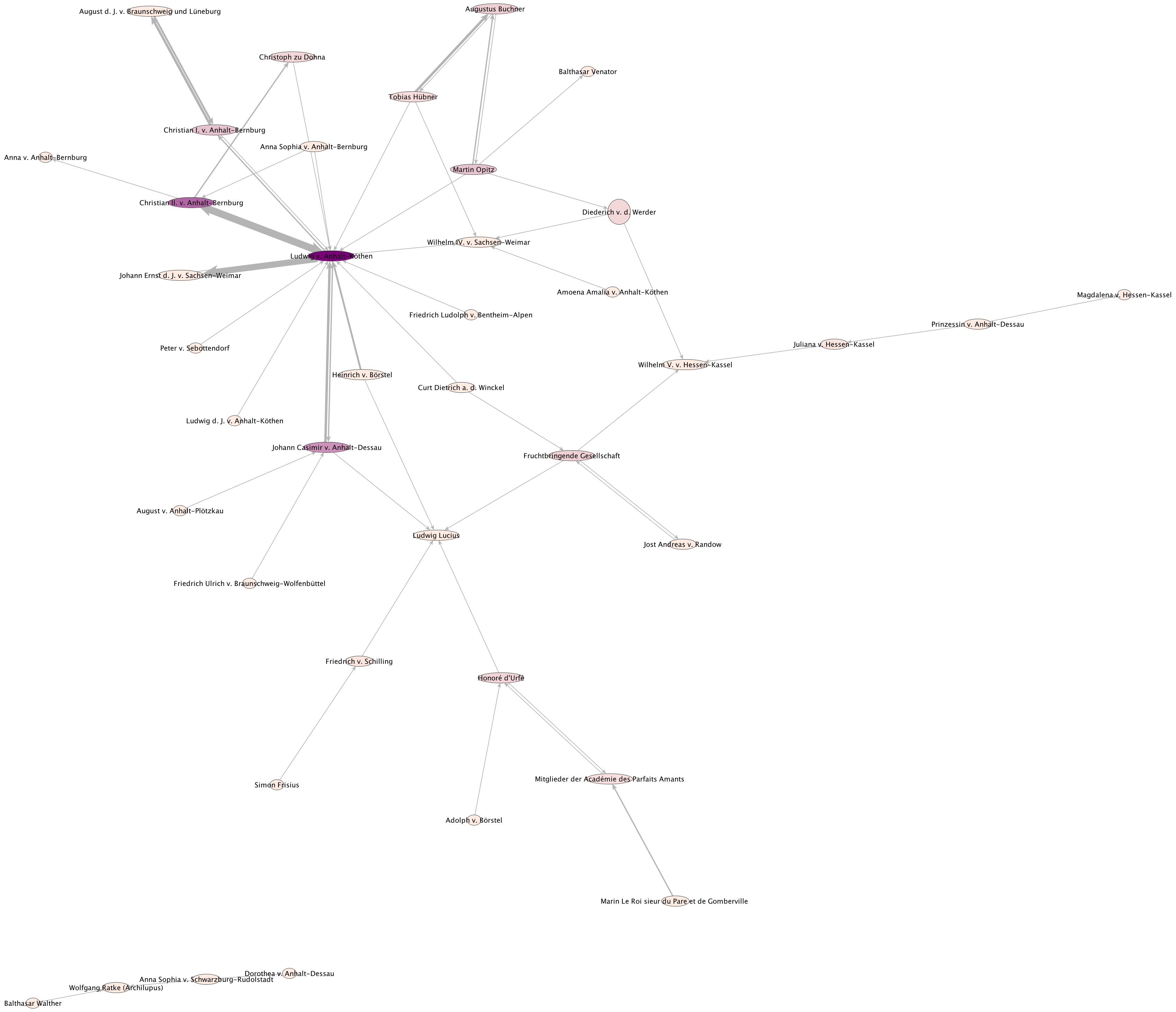
A. Kuczera, Th. Kollatz, T. Schrade, DHd 2016 Leipzig: Methods and Tools for visualising Digital Humanities data sets
03
Wrap Up
- Do not believe in visualization, always critically question the data basis
- Data Criticism: Data are always an extract from an even more extensive mass of possible data.
- Modelling (simplification, shortening) of the "reality" → Data do not represent reality, they point to it
F I N I S
Thank you
Literature & Software
Literature
- Roxana Kath, Gary S. Schaal und Sebastian Dumm, „New Visual Hermeneutics“, in: Zeitschrift für germanistische Linguistik 43/1 (01.01.2015). Online: Crossref, DOI: 10.1515/zgl-2015-0002.
- Malte Rehbein, Informationsvisualisierung. in: Digital Humanities: eine Einführung, herausgegeben von Fotis Jannidis, Hubertus Kohle und Malte Rehbein, S. 328-342, Stuttgart 2017.
Download
- Slides
- License: CC-BY 4.0, Marjam Trautmann, Sarah Pittroff